Roberto de Pinho

Vaccination Coverage

Vaccination Coverage

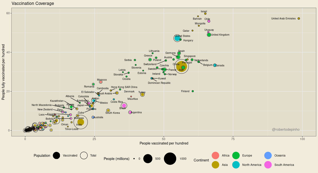
In the chart above, each dot represents a country. The size of the black outer circle represents the total population. The filled inner circle represents the population vaccinated (which received at least one dose), in absolute numbers.

The data source is Our World in Data. In this source, not all countries have data on the vaccinated population, only on the number of doses administered. In these cases, the population vaccinated with at least one dose and the population with complete vaccination are estimated using linear regression with the ratio of total vaccinations and population*. Data from the last available day for each country are used. Only countries with more than 1 million inhabitants are shown.

Charts posted daily on Twitter at @robertodepinho

Other graphics available at: Covid-19 graphics

* In earlier versions, the fully vaccinated were estimated based on the median of the ratio between applied doses and covered population observed in other countries. The vaccinated were estimated based on the assumption that it takes 2 doses to fully vaccinate a person. This second measure would thus be underestimated in those countries that use the Janssen vaccine.

Posted by Roberto de Pinho, 0 comments
Five Indicators

Five Indicators

During the past Brazilian presidential election campaign, a friend asked me to choose a few indicators to evaluate the next government. There is no right answer to this question and my answer reveals my personal views on the matter [of evaluating a government].

I chose five:

  1. GINI index;
  2. Human Development Index;
  3. Unemployment, total (% of total labor force);
  4. Intentional homicides (per 100,000 people);
  5. medianGDP 1.

These would roughly cover five chosen dimensions: inequality, human development, unemployment, violent crime and personal safety and inequality-adjusted income per capita.

For each one of these dimensions there are alternatives. I simply chose the ones I am most used with and starting at my international indicators source of choice: World Development Indicators from The World Bank. Only data for HDI comes from another source, the UN.

Using these international sources has its advantages: data is available for multiple countries and goes through checking so that international comparisons are feasible.

On the down side, data is usually only available for each year and sometimes with quite big delays. One option is to a find local alternative that might not be a perfect match for the chosen indicator but may accurately portray trends.

For each of these indicators, I intend to, but do not promise to:

  • build a chart and graph commenting on past behavior;
  • find a short term alternative and post updates;
  • comment on new available data.

There should be a new post every month. Perhaps more.

I thank Camilo Telles and René Dvorak for their comments and suggestions.

1. from WDI indicators: GDP per capita, PPP (constant 2011 international $) (NY.GDP.PCAP.PP.KD) and GINI (SI.POV.GINI).

Photo by Isaac Smith on Unsplash

Posted by Roberto de Pinho, 0 comments
About spoons, shovels and looms

About spoons, shovels and looms

The story plays like this: Milton Friedman is visiting some country considered to be backward, when he sees some huge construction project being built with shovels instead of tractors and other pieces of machinery. Asking why, he learns that this is to increase the number of workers needed for the job, as providing jobs is one of the main objectives of that government endeavor.  He then goes on to suggest, mockingly, that workers should be using spoons instead of shovels, thus the need for workers would be even greater.

I have seen this anecdote used to ridicule many government interventions in the economy, from stimulus projects to labor regulations, if not every government intervention in the economy. The problem with interventions would be that they sacrifice efficiency to no one’s benefit, that they would be as pointless as building a canal with spoons.

The problem with this line of thought is that it tries to group together and equally discredit actions that have very different profiles when talking about efficiency, labor productivity and ultimately income distribution.

To show this, let’s frame our story a little differently, adding some more color as we go along.  We have three options here: spoons, shovels and tractors, three different final costs for the construction project and three different number of worker hours needed for its construction, but the same outcome: a completed canal or dam or whatever.

Another thing that remains constant in this story, and goes without saying, is how much work is performed by each of the workers involved.  This is never mentioned. Nonetheless, a constant amount of hours of work per worker is required for the story to work.

We have deeply embedded in us how many hours of work a worker should do every day or week. Think about somewhere around 40 hours per week and see if it resonates with you. Now let´s remove this constraint and rethink our story: let’s use tractors and trucks and reduce the number of hours each worker has to do.

From the comfort of one’s office armchair, the spoons option and the option of reduced working hours might look the same, as they have  more or less the same costs, and much higher than the choice of using trucks and the minimum amount of workers. Nonetheless, from the workers point of view, and we also might say, for society as a whole, these are very different scenarios. Now  a worker will have time to take care of his or her children, or learn something new, or just have a better, healthier life. Our analyst might suspect this looking at an index, labor productivity per hour worked, which shows very different behaviours for the spoons and the trucks options.  In fact, labour productivity per hour would roughly be the same whenever using tractors and trucks, either having few workers working full time or many workers working a few hours per week.

So, concerning the option of reduced working hours, we can simultaneously say that it is as productive as employing trucks and few workers, and that it is as costly as the spoons option. How can both these apparently incompatible assertions be true?

To disentangle this, we need to add the perspective of the company running the project. For the company, adding trucks and tractors to a project means increasing productivity and allowing for hiring less workers, thus increasing profits.  In this scenario, productivity gains are kept by the company. If we say now that each worker can only work a reduced number of hours per week, it is still in the best interest of everyone involved to employ machinery, but now the derived productivity gains are shared with the workers, which is reflected in higher costs from the firms perspective.

What is hidden in the original story is a discussion on income distribution. Yes, there has been plenty of regulations that certainly hurt productivity, such as the need for operators even in automated elevators1, but one cannot say the same of labour market interventions such as setting a maximum workweek or establishing a minimum wage. What they most importantly do is to level the play field between workers and employers. Yes, if your enterprise’s quality and competitiveness are only based on having cheap labor, you might be driven out of business. If not, you have other options, such as having a better pay structure.

Minimum wage and other work related regulations must be discussed in tandem with labour productivity and corporate profit behaviour, as well as trends in unemployment. To disregard these in evaluating  the minimum wage is to miss the point.

This debate is not new, as it is also not new the opposition to  labor regulation, implying the ruin of the industry if it is adopted. This excerpt is from the Oxford Economist Nassau Senior, in 1837, opposing a limit of 10 hour work day at factories:

“I have no doubt, therefore, that a ten hours’ bill would be utterly ruinous. And I do not believe that any restriction whatever, of the present hours of work, could be safely made. … The manufacturer is tired of regulations?what he asks is tranquility?implora pace.”

As we all know, despite those dire warnings, the United Kingdom economy became everything but ruinous.

I thank Beto Boullosa, Camilo Telles and Walter Hupsel for their comments and suggestions.

1. Lei Municipal 1.626/90 (Rio de Janeiro)

Versão em Português / Portuguese Version

Photo by Mari Potter on Unsplash

Posted by Roberto de Pinho, 0 comments
The World Cup as a flow map

The World Cup as a flow map

A Flow Map/Sankey Diagram showing the complete results from the World Cup model:

The chart has alternating nodes (blue bars) for teams and matches. Size of flows are proportional to the chances of a country being part of a match (from country to match bar) or proportional to the chances of winning a match (from match to country). Numbers after a country name are the chances of that National Team proceeding to the next phase. From  the quarter finals onwards, only teams with more than 1% chance of winning the World Cup are presented individually. The others are grouped under “others”.

A more complete version of the diagram, which takes a while to load, can be found here.

If it does not load on your device, you can look at a screen capture of it here.

This is the table of country codes:


Thanks to Viviane Malheiros for comments and suggestions.

Posted by Roberto de Pinho, 0 comments

Will Germany win the world cup?

In a previous post, I showed results from a model that gives a 23 percent change of victory for Germany in this year’s World Cup. It is the highest score. So, can I jump and say that Germany will win it, or worse yet, can I bet my savings that it will do so?

Short answer is: No.

As for a long answer, let me start reminding that I know nothing about football (soccer) and can’t even name a single player from Germany’s national team other that Bekenbauer, whose name I probably even can’t spell right. I am not even sure that he’s not a tennis player :-).

Keep also in mind that the model used for predicting winners for each match is very simple and that the main goal for this exercise, aside from being a learning experience for the intern, is to provide, at best, a common sense level understanding of how this Cup might play out.

This been said, the rule of thumb on making statistical predictions is to go back and see, whenever possible, how your model might have worked in the past for events that already have happened.

So, what would this model say before the last World Cup? I did not run it with data from the 2010 cup, nonetheless, it is safe to say that the winner, Spain,  would probably be no better evaluated at that time than it is now. In the current model, it has about 5% chance of winning and this is already impacted by the points Spain amassed in its winning campaign of 2010.

Thus, if, back in 2010, you took the country with the highest probability of winning and told everyone that it would certainly be the winner, you would have been wrong.

This is not to say that the model is or was absolutely wrong. The problem here is abusing it by using results beyond what they tell us. A 23% percent chance of winning, despite being the highest in the table, only says that out of 4 or 5 World Cups, Germany would win one of those. There are still 3 or 4 other potential World Cups where Germany does not win.

Going forward with this reasoning, an interesting thing to do is to contrast the model’s given probabilities with the list of actual winners of World Cups. The model has Brazil with a 22% chance of winning. This is a little over 4 out of the 19 past World Cups. The actual number is 5. For Argentina, the model hits the mark: a 13% chance of winning is equivalent of winning 2 of 19 past cups, what they actually have done.

Results being close is no surprise as the model is built on the past performance of teams in those 19 World Cups. On the other hand, their discrepancies can tell us a few things. First, we see that the model leaves some chance for the victory of teams that have never won before, which is a good thing.  Second, the fact it is based on points and not on wins is evident from what it says about Uruguay, predicting no victory for it. Despite having two wins, Uruguay has almost only half the number of points of Argentina, the other nation with two World Cup wins.

And lastly, it shows that this year, though we cannot say it will win for sure, Germany indeed seems to have a nicer path to victory than expected.

I thank Andre Luchine, Beto Boullosa, Charles Queiroz, Fernando Varejão, Marcio Eduardo Bezerra and Neca Boullosa for their consulting on the inner workings of the World Cup and Eduardo Viotti for questioning the model’s performance against the past.

Posted by Roberto de Pinho in English, the world, World Cup, 0 comments

The mean, the median and the GDP – part II

[latexpage]

A version of this post was originally published in Portuguese as a guest post at Walter Hupsel’s blog On The Rocks @ Yahoo! Brasil. This continues from The mean, the median and the GDP – part I.

Using simple arithmetic, the GINI index allows for converting the GDP per capita into the median GDP, assuming that incomes follow a Pareto Distribution. For example, Namibia’s GDP per capita for 2011 is USD 6,3261, however, taking into account its 63.90 GINI index, the median GDP is calculated at USD 2,392 . That is a huge difference.

The equation that gives the median GDP, which perhaps would be more appropriately called a GINI adjusted GDP per capita, is:

\begin{equation} \label{eq:medianGDP}

medianGDP = \frac{\sqrt[\alpha]{2} \times (\alpha-1)}{\alpha}\times GDP \textit{ per capita}\text{, where } \alpha = \frac{1}{2\times GINI}+\frac{1}{2}

\end{equation}

If you tolerate an error up to about 6% in relation to what is expected given a Pareto distribution, you can simply use $(1- GINI)\times GDP \textit{ per capita}$.

Now let’s take a look at Ukraine, with a GDP per capita that is equivalent to Namibia’s in 2011, at USD 6,365. Ukraine has a much better GINI index of 25.62, yielding a median GDP of USD 5,000, more than twice that of Namibia. This is much more consistent with Ukraine’s High human development and Namibia’s Medium human development, according to the Human Development Index, where they stand at the 78th and 128th positions, respectively, and not at the same position, as suggested by GDP per capita.

chart_1

Probability density curves for simulated data with same GDP per capita as mean but much different GINI indexes. Uses log scale.

Median GDP can also provide a richer perspective on the progression of GDP of a country and its impact on the population. The USA saw its GDP per capita grow 74% from 1980 to 2012, while its median GDP or mGDP grew somewhat less, at 52%2. Looking at the period from 2007 to 2012, a period encompassing the Great Recession, one gets a picture of full recovery using GDP per capita, while mGDP would show a decrease of almost 3% in the period, still an improvement over the peak of crisis in 2009, but not quite yet the full recovery shown by GDP per capita.

chart_2

Progression of GDP per capita and median GDP for the USA having values for each variable for year 2007 as indexes (=100).

As with any indicator, this median GDP measure has its shortcomings. The GINI index, which is required for computation, has lower availability than GDP per capita, sometimes only at 10 year intervals at the WDI database . Nonetheless, some procedures could be adopted to minimize this problem. Since GINI fluctuates somewhat less between years in a country than across countries in a year, using the last available year data can still yield better results for comparing multiples countries than the raw GDP per capita measure . Nowcasting procedures could be used on GINI data available at larger intervals and yet produce nicer long term views of the economy. For countries with no GINI index data at all, mGDP could be set at 63% of GDP per capita, assuming the median GINI index of 41. Its adoption will certainly require some work to improve data availability, quality and comparability, a challenge even for the ever present GDP, as Bill Gates made the case recently .

All of us who make a living out of statistics know that they can become an adverse influence on policy. When we focus on GDP per capita, we are taking into account a non-existing person, focusing on a measure that can improve regardless of what happens to the bulk of the population (i.e., the mean actually represents nobody instead of the average of everyone). We should be focusing instead on the mythical average Joe or Joana or Tomihiro or Neo, the one figure that divides the population in the middle, the one that only changes if a good chunk of the population does, and that’s what mGDP can show us. If we start to see this number on the home page of World Bank, or brilliantly promoted by Roslings’ Gapminder, or perhaps on the cover of The Guardian, perhaps we can hope that policies may be at least a little bit diverted towards the bulk of the population of our countries.

Some data tables, R scripts and a view of similar and equivalent approaches is next on this series. I kindly thank  comments and suggestions received from Andre Luchine, Beto Boullosa, Camilo Telles, Eduardo Viotti, Emilia Spitz, Joniel da Silva, Leonardo Fialho, René Dvorak, Vini Pitta and Walter Hupsel.

1. Unless otherwise noted, all figures from World Development Indicators, access on December, 31st , 2013. Indicators: GDP per capita, PPP (constant 2005 international $): NY.GDP.PCAP.PP.KD; GINI:SI.POV.GINI, latest available year.

2. GINI data for the USA from FRED: http://research.stlouisfed.org/fred2/series/GINIALLRH , not compatible with WDI data;

Some of the R Scripts for this post

Posted by Roberto de Pinho, 0 comments

What do you tell me about the world cup?

I do not care for football (soccer). So what do you do in order not to be totally alienated from the surrounding conversations in a world cup year?  More so when the cup is happening in your home country?

To me it involves running some R script to assess the chances for each team and who will be playing where.  It all began as an exercise to show the economics intern how to build a Monte Carlo simulation in the R software environment for statistical computing and graphics.

The script has two main parts: (i) the probability of victory for each team pairing, let’s say Brazil and Germany; (ii) using those probabilities, run simulated world cups, game by game, randomly drawing winners and moving on to the next game according to the previous random results.

I ran one million of those simulated world cups. That’s most likely well above what’s needed for many statistically significant uses. But this is not a computation intensive task and runs in not much time.

The simulation of games is quite neat and gives interesting results. For instance, if you run a batch where there’s only one favorite team and all the others have the same chances in head to head matches, those teams that cross the favorite’s path to victory are penalized and end up with the worst chances of winning the cup.

The other neat thing of the simulation is that you can have game-by-game odds, not only of who wins but also who will probably play each match. Of course, this comes from the fact that a game’s players are the winners of matches from the previous round. So, if you have a ticket for a game of the quarterfinals you can check what is the match that you will probably watch.

The other part of the script requires figuring out probabilities for each match. And here is where things are less solid in this exercise and where there is most room for improvement. Nonetheless, we still can say that end results are at least plausible, as we will see.

These probabilities are based on a list of points earned by each country in world cups. For each match, the probability of victory for a team is its share of points in the sum of points for the two teams in that particular match. So for a Brazil X France, Brazil had 216 points, France has 86 points, so Brazil’s chances are ${216}\div{(216+86)} $ or 72%. Of course there are some much more complex and better models. Notice that no attempt is made to model the possibility of ties.

So what kind of things do we see in results? For example, we see that Portugal had about 10% of chance of being part of the semi finals. This is consistent with a friend’s assessment of Portugal as having “some chance” of doing so.

Now, if this model allows me to mimic the opinions of a football fan, then I would say it has accomplished its goals 😀

But what probably most people will be interested will be who will win the Cup. So, to get this out of the way, this is the table:

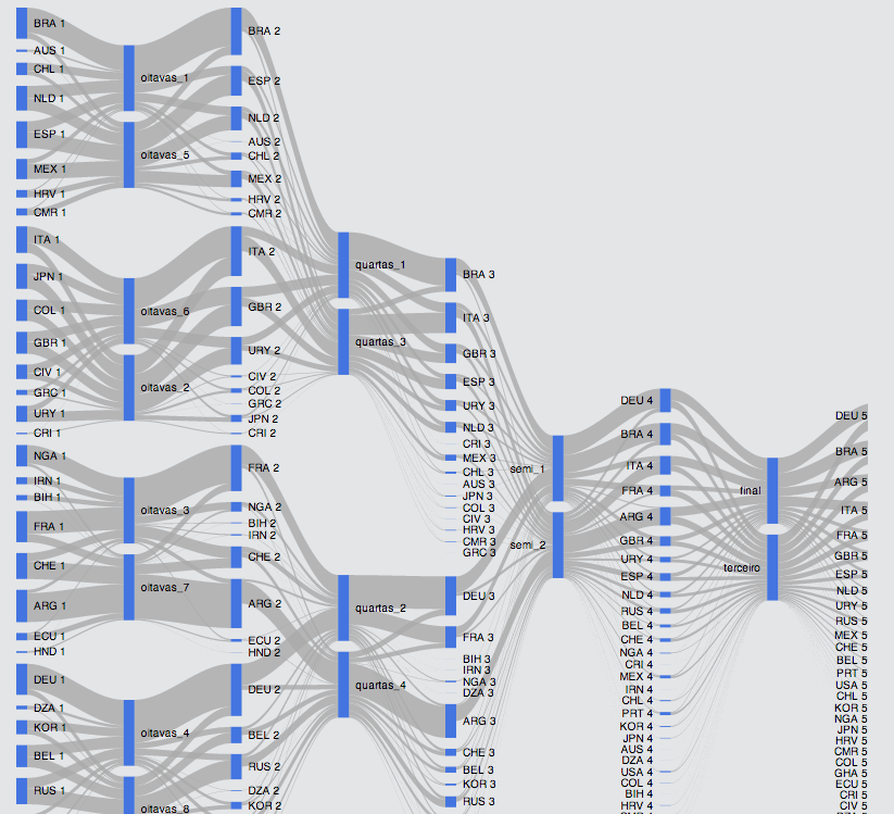
We can follow this information step by step, figuring out the distribution of victories among countries. That is what I try to show in the next chart, from the round of 16 (oitavas) until the final:

In this chart we follow the distribution of victories among countries as the final match approaches.

Another interesting thing to do with the model is to re-run or re-query it after each game, fixing whatever has already happened. This works up to the final, where the answer that we will get is the one given by our simple match winner model.

Somewhere in the future, hopefully before the world cup, I might be posting odds for each game.

You can download the file with the winners for all the 1 million simulations here. The R script is here.

I thank Andre Luchine, Beto Boullosa, Charles Queiroz, Fernando Varejão, Marcio Eduardo Bezerra and Neca Boullosa for their consulting on the inner workings of the World Cup.


Posted by Roberto de Pinho in English, R, the world, World Cup, 0 comments

The mean, the median and the GDP – part I

A version of this post was originally published in Portuguese as a guest post at Walter Hupsel’s blog On The Rocks @ Yahoo! Brasil.

For over 50 years we have had Huff’s “How to Lie with Statistics” telling us that we should know better. And yet, we still rely on the wrong average in one of our most important tools for evaluating the world and countries’ economies: the GDP per capita. We are still using a mean in places where a median would be the better choice.

Gross Domestic Product (GDP) per capita1 is a simple and effective indicator, coming from a straightforward division of GDP by the population, being used appropriately and elegantly in many instances. Nonetheless, the GDP per capita cannot escape the hard reality that it is a mean average. Thus, as Huff warns us, it has shortcomings and flaws: it fails to capture the effects of inequality in a given reality. From this, one could say that this “mean” average is mean in the sense that it’s cruel and unkind.

But… Can we do better now?

The GINI index has reached mainstream status and is now the de facto standard for measuring income inequality. It measures how much the distribution of income deviates from an even division. A value of 0 in GINI would then be found only in an absolutely egalitarian society where everyone earns exactly the same. In contrast, a value of 100 would imply the entire income earned by a single individual or household. In the real world, it ranges from the low 20s (better distribution) for countries like Denmark and Belarus, to over 60, in the case of such unequal societies as Namibia or Botswana. Brazil’s GINI is 552.

It is time to move on to the median GDP, derived from GDP and GINI. It is a fresh metric that may better reflect both the changes in the economy’s output and trends in income distribution, while accounting for population sizes. It is to the GDP per capita what the median is to the mean.

While the mean is the average of all values in a given set of values (the sum of all values divided by the set size), the median represents the value found in the middle of the set, dividing it in two equally sized halves. Means are affected by extreme values, whereas medians are not. As we can see in the classical “How to lie…” example, an increase in earning of the best paid employee would change mean pay, whereas the median would not move. To move the median requires a change of pay for those in the middle section of the population, those that are neither the wealthiest nor the poorest. This is to say that this median GDP would better reflect the reality of our imaginary average Sally or Joe.

Policies that target economic growth regardless of its [human] costs have support in GDP per capita, which rises even if only a few benefit from these policies. Median GDP would not be fooled or let us be fooled by that.

 to be followed with more detail and examples. I kindly thank  comments and suggestions received from Andre Luchine, Beto Boullosa, Camilo Telles, Eduardo Viotti, Emilia Spitz, Joniel da Silva, Leonardo Fialho, René Dvorak, Vini Pitta and Walter Hupsel.

1. The article could similarly discuss GNI per capita. GDP per capita is chosen due to its wider use;
2. Unless otherwise noted, all figures from World Development Indicators, access on December, 31st , 2013. Indicators: GDP per capita, PPP (constant 2005 international $): NY.GDP.PCAP.PP.KD; GINI:SI.POV.GINI, latest available year.

Posted by Roberto de Pinho, 0 comments