
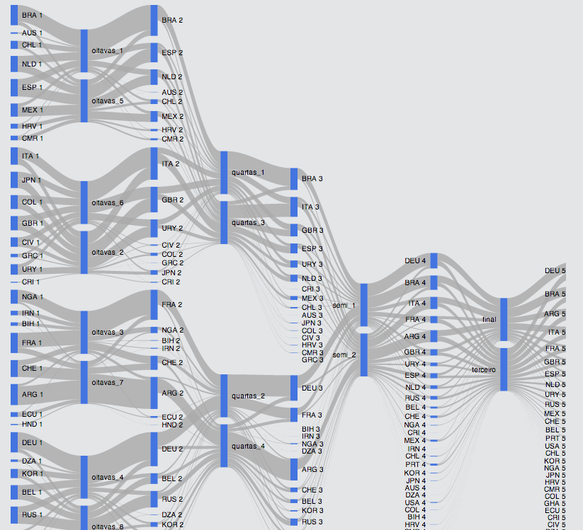
A Flow Map/Sankey Diagram showing the complete results from the World Cup model:
The chart has alternating nodes (blue bars) for teams and matches. Size of flows are proportional to the chances of a country being part of a match (from country to match bar) or proportional to the chances of winning a match (from match to country). Numbers after a country name are the chances of that National Team proceeding to the next phase. From the quarter finals onwards, only teams with more than 1% chance of winning the World Cup are presented individually. The others are grouped under “others”.
A more complete version of the diagram, which takes a while to load, can be found here.
If it does not load on your device, you can look at a screen capture of it here.
This is the table of country codes:
Thanks to Viviane Malheiros for comments and suggestions.